
Hurricane Maria hit Puerto Rico in September 2017. In the days following the hurricane, the government reported just 64 deaths.

This number reflected only those directly killed by the hurricane — those found the next morning or soon after — and did not include the thousands who died in the weeks and months after the disaster. Maria hit the infrastructure of Puerto Rico hard: there were major power outages that shut down hospitals, medical supplies ran out and other critical infrastructure across the island collapsed. In a special assessment commissioned by the government of Puerto Rico a year later, a team of researchers revised the number of deaths after the event. The total count rose to 2,975 — 46 times higher than the original estimate. 
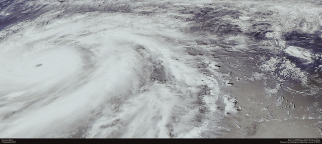
Satellite photo of Hurricane Maria
Hurricane Maria from satellite; image by Antti Lipponen, licensed under CC-BY.

The example of Hurricane Maria is not unique. In many countries, the databases used to track the impact of disasters can be badly wrong.
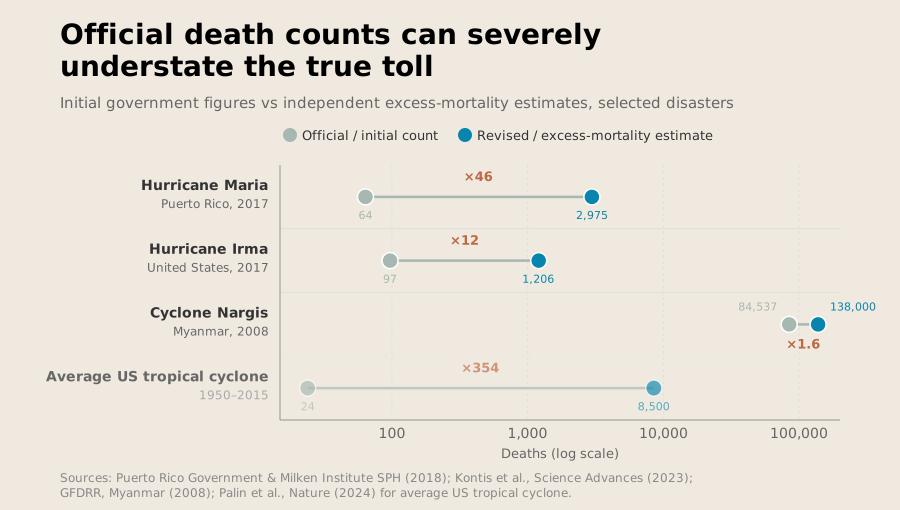
Chart showing the large differences between initial death counts and excess mortality from disasters
Across contexts, initial death counts underestimate the total death toll.

They rely mainly on government and news reports — but those are shaped by when governments choose to provide information and how these governments define what counts as disaster impact. The data isn’t just used for academic purposes; disaster figures weigh heavily in today’s world. They can influence which countries receive funding and where disaster funds are spent.

While these decisions are often framed as technical, there is a political dimension to disaster reporting. The data can often determine whose suffering is recorded and prioritized. We treat these figures as facts, but they are not. They are generated by systems, with the same fragilities as any other policy realm. Disaster data is far less reliable than its users often assume.

The criteria for good data are not controversial. Data should reflect what actually happened, capture the full picture, remain comparable across time and geography, and not count the same event twice. Unfortunately, we are far from achieving that. 

How Disaster Databases Actually Work

We need data from disasters. Recovery efforts must be planned, humanitarian assistance delivered and resilience plans made. The Emergency Events Database (EM-DAT) is the most widely used free source of global disaster data, covering both technological and natural hazards. It has records of more than 27,000 events since 1900. For an event to be included, it must meet at least one of three main criteria: 10 or more people killed; 100 or more people affected; or a declaration of a state of emergency or call for international assistance. 

While reasonable, these criteria mean the dataset has blind spots. A drought that killed nine people will typically not be included in the database, unless it triggers an emergency declaration or an international call for aid. The same occurs for a flood that affects 95 people. And there’s an important caveat there: it is focused on the number of people reported affected or killed. If the reporting isn’t accurate, neither is the database. EM-DAT requires cross-verification of each event from at least two independent sources, which are often international agencies, wire services and English-language media.

Given this, geographical bias in media reporting is likely to propagate into the EM-DAT database itself, leading it to capture more disaster events in developed economies than in less developed ones. It also lets governments manipulate the data. If the government only admits to nine deaths, the event won’t be included — even if there are far more than nine deaths in reality. This lets governments evade accountability for their actions.

Consider the 2008 Sichuan earthquake in China. Several of the hardest-hit areas were poorer counties in the region, and many buildings collapsed. The official death count was fixed at around 70,000, with a further 18,000 people still listed as missing. Parents, activists and journalists who tried to seek accountability and investigate construction codes and the collapse of buildings were targets of censorship, detention and surveillance; the full toll and responsibility, especially for the school collapses, remain difficult to verify independently. 

Even when an event meets the thresholds, other information may be incomplete. Information on economic losses is the main source of missingness; it is unavailable for 80% of the events recorded from 2000 to 2020. Economic damages are hard to calculate and are rarely provided in low- and middle-income countries. Just 4% of African disasters recorded in EM-DAT have economic damage estimates.
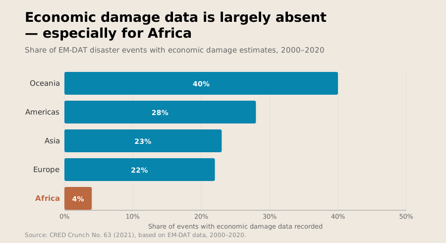
Chart showing how few disasters have economic damage estimates
While no region has complete coverage of economic damages, Africa has particularly bad coverage.

But this doesn’t stop people from using the data off-the-shelf. A growing number of highly influential and widely cited publications use this data for empirical studies with very limited acknowledgement of its problems.

The scale of the limitations becomes clearer when you compare disaster databases. Between 1971 and 2002, EM-DAT recorded 97 disasters in Colombia. Another database, DesInventar, recorded more than 19,000 in the same period. Only a small percentage of the local events in DesInventar would meet EM-DAT’s definition of a disaster, but taken together, the “small” events in Colombia caused more than $1.65 billion in damages. This is around seven times the economic losses caused by one of Colombia’s deadliest disasters, the Nevado del Ruiz volcanic eruption. Together, these “small” events pack a big punch.
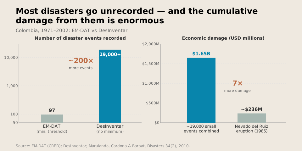
Chart showing small disasters combine to have more impact than large disasters
There are many small disasters; together, they cause as much damage as large events.

DesInventar represents a different type of disaster database. Instead of setting specific criteria for inclusion, DesInventar allows countries to freely build their own disaster inventories. In general, this means that it includes smaller disaster events, but it also means the quality of the data included within the database depends on each government’s capacity to collect and maintain records. This can vary considerably. Peru is a prime example. Its data uses a single source — and events near Lima are far better covered than events in more remote parts of the country. 

Nor is that the only discrepancy. The count of those who are “affected” can vary substantially. EM-DAT defines those affected as requiring immediate assistance, but countries have different standards for what is considered “assistance.” Some include all those in the disaster zone; others include only those who lost housing, while still others count assistance requests as the parameter. Countries might even strategically choose who counts as affected, because such data can help determine if a country qualifies for climate adaptation financing or not.

Other categories of data are even murkier. As noted, economic damage estimates are often missing and where they do exist, the data is sketchy at best. Some studies comparing disaster events between EM-DAT and DesInventar found that damage figures diverged by more than 20% in most cases.

Turning Disaster Data Into Policy

This may seem an academic concern. It is not. These databases are used in real policy decisions.

The United Nations Office for Disaster Risk Reduction uses both EM-DAT and DesInventar for its Global Assessment Reports, one of the main publications guiding international disaster policy. United Nations Member States also report their progress through the Sendai Framework Monitor, which uses disaster databases as inputs. This is then used to track progress, identify disaster-risk priorities, guide resource allocation toward risk reduction and help plan climate adaptation strategies.

Climate finance, a sector that moved $1.9 trillion in 2023 alone, also uses disaster databases to assess climate-related disaster risk. Countries often use Germanwatch’s Global Climate Risk Index to discuss the need for funding support for adaptation or losses. Germanwatch’s current index uses EM-DAT with a few caveats on its limitations. This loss and damage analysis, for instance, uses the index without discussing its data limitations.

The reliance on EM-DAT goes beyond the Global Climate Risk Index and into the operational structures that determine humanitarian funding flows. The INFORM Risk Index uses EM-DAT for a few of its hazard indicators and has been used by the United Nations Office for the Coordination of Humanitarian Affairs, the European Commission’s Civil Protection and Humanitarian Aid Operations, the World Food Programme, the United States Agency for International Development, the UN Central Emergency Response Fund and more to help prioritize and allocate humanitarian resources. Mistakes in EM-DAT could leave disasters underfunded. This might occur if many more people died than are reported in EM-DAT because their deaths were not reported in English.

In 2015, the Malawi government paid $5 million for drought insurance through the African Risk Capacity (ARC), which pays out when its model estimates that a drought has crossed a given threshold. After the 2016 El Niño drought, which left 6.5 million people in need of aid, the model initially found that no payout was warranted, based on a false assumption regarding the maize variety farmers had planted. A payout was made in 2017, by which point the response had cost around $395 million. 

Building Firmer Ground: Five Fixes


We clearly need disaster data. Without databases like EM-DAT and DesInventar, we would not be able to understand and respond to disasters. It would be far more difficult to respond to climate change and plan adaptation strategies to prevent future disasters. But they are far from perfect.

Improvement is possible, though. Indeed, as the world warms, and climate-related disasters become more frequent, improvement is necessary.

First: we must begin to treat disaster databases not as a single source of truth but as part of a system. Each disaster database is a measurement tool with reported limitations, but considering them together can limit the errors. Resource allocation should be triangulated between different disaster databases and local disaster inventories. This will help limit missing data — especially vital given that smaller, recurring events represent an important share of the disaster impact.

Secondly, disaster impact should be reported in ranges, not in a headline figure alone. It is too easy for policymakers to focus on a single number without taking into account the uncertainty behind it. In 2015, the Integrated Research on Disaster Risk program recommended that disaster data should include reliability information such as a quality score or uncertainty level. Initially reported mortality figures from Hurricane Maria were 46 times lower than those produced by the excess mortality analysis. A reporting range would not have eliminated the discrepancy, but it would signal to policymakers that the number was provisional rather than definitive. 

Third, we must verify official counts independently. Governments are not always incentivized to tell the truth, and even if they are attempting to do so, different standards can lead to vastly different estimates of damage. Instead of relying on a count of people in a damaged area, we should focus on excess mortality as a standard post-disaster metric. This would provide an independent data point against which official figures can be assessed; if a government gives a figure that is many times less than the number of excess deaths, they can be called to account.

We can also use satellite imagery to validate data. This was used to great effect after the Haiti earthquake in 2010, as well as in Turkey after the 2023 earthquakes. These technologies cannot replace ground-level data collection, as they cannot count individual people. However, they provide a form of independent analysis that can be used to compare against other figures that enter disaster databases. This is particularly useful in contexts with weak data collection or reporting infrastructures; in countries like Haiti, it can be nearly impossible to collect data door-to-door.

The fourth fix goes hand in hand with this. We must also better fund local data systems. Several countries have adopted DesInventar-based systems for their own disaster loss accounting, but there are few incentives for maintaining these systems. Every year, governments need to train personnel, validate data and verify that interconnected systems actually function together. Each of these costs money, and none happens automatically; international organizations should help support this where possible.

Fifth, make the limitations of the data visible. No policy document should use disaster data without caveats. Each disaster database comes with its own biases; none is perfect. Without caveats, policymakers may take the data off-the-shelf without considering those biases. Every report that cites disaster data should include material like SDG monitoring metadata, INFORM’s reliability score and Climate Analytics’ loss and damage briefing to provide the reader with context about the data reliability.

No system is perfect, and the systems built to account for the impacts of disasters, including who was affected, the size of the human losses and the economic cost, will always carry intrinsic assumptions, political pressures and institutional limitations. But we can do better than the current system, particularly as natural disaster frequency increases due to climate change. Preventable mistakes will come with a death toll, and right now, disaster databases risk mistaking what is currently reported for what matters. 

Matheus de Souza is a PhD student in Disaster Science and Management at the University of Delaware and has worked with different humanitarian organizations such as the United Nations High Commissioner for Refugees and the Norwegian Refugee Council. He studies several aspects of disasters, with a focus on inter-organization coordination.
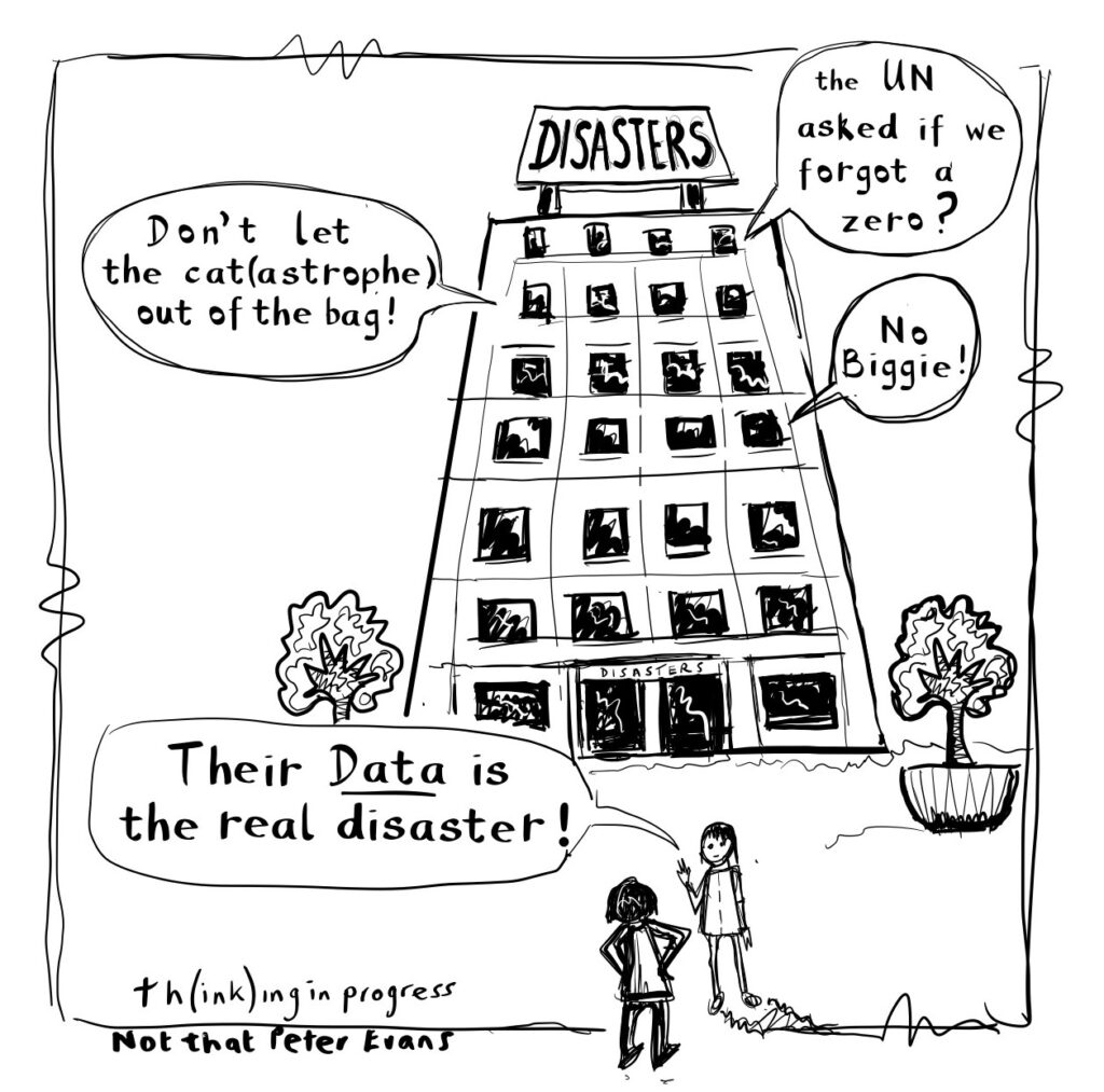
Cartoon of people saying "their data is the real disaster"

If you have comments on this article, or wish to contribute to the discussion, please email them to letters@indevelopmentmag.com. Responses will be featured in a letters section.

Even as global progress against poverty seems to slow, India has remained a bright spot. In the last several decades, the now most populous country’s transformation has been nothing short of extraordinary, with per capita incomes increasing by over a factor of six in a quarter century.

The share of the country’s population living in extreme poverty has been slashed, as has the rate of child mortality, which fell by nearly 80% from 1993 to 2021.

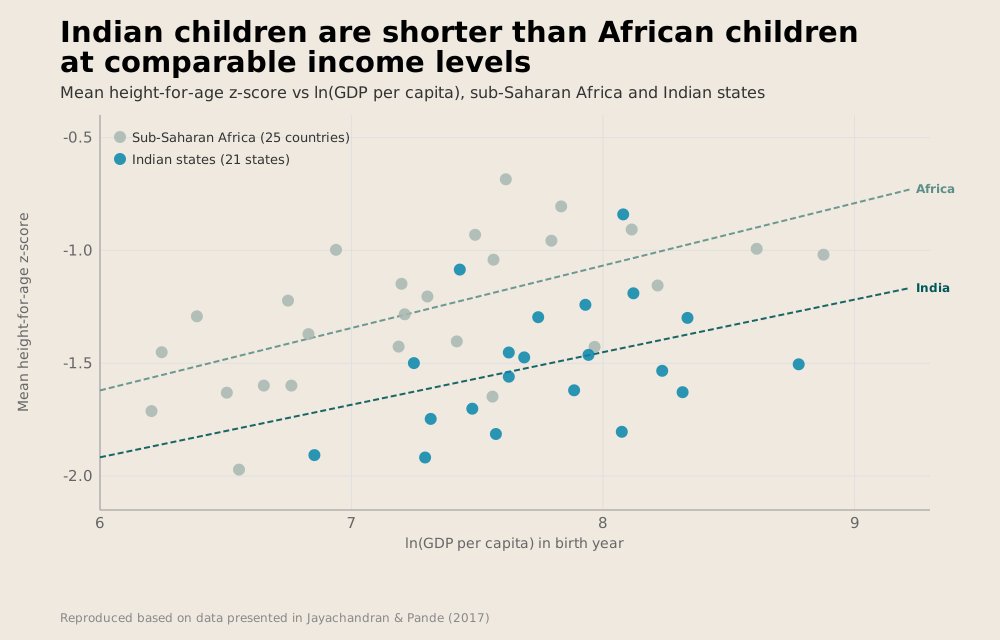
So why are its children so short? Even as India’s per capita income has outpaced the per capita incomes of many of its counterparts in Sub-Saharan Africa, India’s children remain some of the shortest in the world—much shorter than their peers in Sub-Saharan Africa. India is a rising giant, but its children are anything but.

Chart of height-for-age z-score vs. ln(GDP/capita) in Africa and India
Indian children are shorter than African children at comparable income levels.

To readers in rich countries, this fact may not immediately come across as cause for concern. Height is a product of genetics, so short Indian children may simply reflect differences in potential heights across ethnic groups. Indians may simply be a short people—genetically prone to being shorter than Africans or Europeans.

Thinking of height as predominantly a product of genetic inheritance, however, is a luxury of having a high income. In the United States—and other rich countries—children rarely eat too little or become too sick to grow to their full potential height. There, height largely is a product of genetics. This is not the case in many poor countries, where malnutrition and childhood disease abound. Many people in poor countries are short in adulthood not because of short parents, but because they do not eat enough or are too sick in childhood to grow. Calories in, centimeters out.

Childhood stunting can have lasting implications. Economists have long shown that taller people earn more. This result is likely not because employers simply prefer tall people; rather, nutrition also matters for cognitive development. Malnourishment starves the growing brain of much-needed energy, and stunting may be a physical sign that children are not achieving their maximum cognitive potential. Furthermore, if malnourished children are stunted both physically and cognitively, effects may persist long beyond childhood. Full nutrition in adulthood may be insufficient to make up for deficits early in life.

Governments therefore care a great deal about how short their citizens are. They also want to know why children aren’t getting what they need to grow. It behooves a government to know if it is childhood illnesses, sanitation or another factor at play. Without this information, they risk not only a physically but cognitively stunted generation. Though heights no longer remain our only measures of population well-being, they are a useful and transparent yardstick. For that reason, measuring them has become a central part of many household survey programs, including India’s National Family Health Survey (NFHS).

Heights are also relatively easy to measure. It is much easier to pull out a measuring tape than collect a blood sample. We can even look at historical data to see the rise and fall of civilizations.

One of the most transparent ways to see the declining fortunes of Native Americans in the American Great Plains is through falling heights. Native Americans were once some of the tallest peoples in the world, a status they abruptly lost with the slaughter of the bison at the end of the 19th century.

So: Rich countries should have tall kids. And as countries get richer, their kids should get taller. But in this simple taxonomy, India is a dramatic outlier. Heights have grown alongside the country’s per capita income, but at a remarkably slow rate—much slower than in other countries.

Is it just genetics? It can be difficult to tell, because you have to disentangle a person from the place where they live. Telling whether a child in Bihar is short because they live in India or are Indian is an impossible task that even the best econometric tools cannot hope to resolve. To find answers, researchers therefore study people for whom person and place are decoupled: immigrants. 

Economists Caterina Alacevich and Alessandro Tarozzi do just that, studying Indian families who migrate to the United Kingdom. When they arrive, Indian immigrants are shorter than native Brits. However, remarkably, their young children are as tall as their British peers, catching up in a matter of one generation.

This finding is striking. It does not seem to be simply that Indians are just shorter than Africans (or Brits). Something causes Indian children to stand shorter than the children of other nations. And whatever that something is does not fit in the overhead compartment when flying from Delhi to London.

If it’s not genetics, then what explains the Indian height enigma? One answer may be (eldest) son preference. Thirty-five years ago, Nobel Prize-winning economist Amartya Sen drew the world’s attention to an unsettling fact: The world had fewer girls than it should, with many Asian and African countries having a larger male than female population. The number of “missing women,” and the reasons they are missing, are controversial, but researchers often point to causes like sex-selective abortion or female infanticide.

Even when girls are born, though, they may receive fewer resources. In India, eldest sons in Hindu families often play important social roles, living with aging parents and inheriting property. Eldest girls—or indeed, girls in general—play no such role. This may encourage poor families—with only limited resources—to prioritize eldest sons over other children. In a paper in the Quarterly Journal of Economics, for example, economists Seema Jayachandran and Ilyana Kuziemko show that women stop breastfeeding daughters earlier if they do not have older brothers. Because breastfeeding suppresses ovulation and delays the return of fertility, mothers without sons may wean their daughters earlier in the hopes of conceiving a boy. 

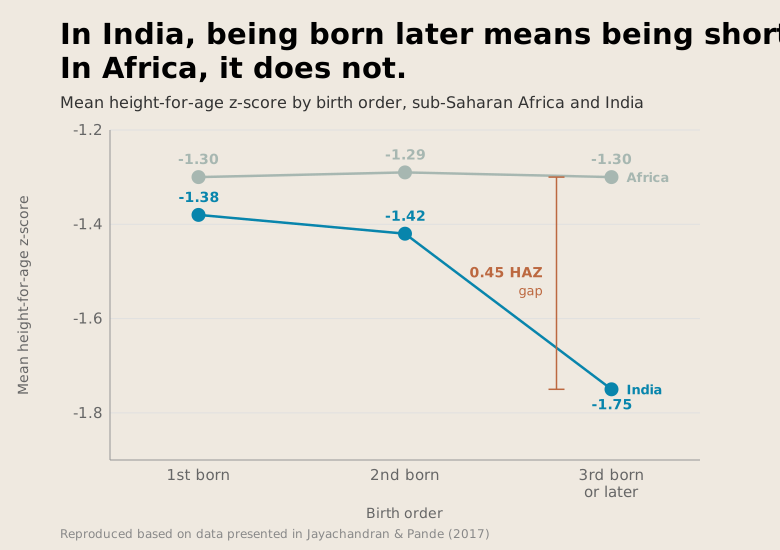
Perhaps it is simply that eldest children, regardless of gender, get the resources. In the American Economic Review, Jayachandran and Rohini Pande argue this is the case in the aptly named paper “Why are Indian Children So Short?”  showing that though on average Indian children are shorter than African ones, this is not true for all types of children. Firstborns in India are as tall as their counterparts in Sub-Saharan Africa, but a gaping divide emerges for non-eldest children. Thirdborns and later in India are a third of a standard deviation shorter than their counterparts in Sub-Saharan Africa, compared to no gap for firstborns. Eldest sons are prioritized, and eldest daughters—by nature of their age—are less likely to have an older brother to compete with for resources during the nutritionally vital early years of life. This favoritism may come at the expense of later-born children.

Chart of height-for-age z-score vs. birth order in both Africa and India
Birth order affects height much more in India than in Africa.

Jayachandran and Pande’s paper has been very influential in academic economics, becoming a somewhat definitive source on the role of son preference in Indian society. However, their claims have not gone unchallenged. Diane Coffey, a sociologist, and Dean Spears, an economist and demographer, both of the University of Texas at Austin, have questioned the birth order hypothesis.

What could explain the fact that firstborn sons are taller than second or thirdborns? One answer is Jayachandran and Pande’s—eldest son preference. Another is that firstborns come from different kinds of families than second or thirdborns. The sample of firstborns across a whole population includes many kids from families with one child. Secondborns, by contrast, come from families with at least two children, and thirdborns necessarily come from families with at least three kids. In a recent paper, Spears and Coffey alongside economist Jere Behrman show that this effect is important in India, where larger families are also generally poorer. In other words, firstborns without siblings are more likely to come from richer families, where it is less likely that children won’t have enough to eat. Jayachandran and Pande are aware of this fact, and adjust for maternal characteristics to try and account for it. However, Spears, Coffey, and Behrman argue that conditioning on family size directly largely eliminates the link between birth order and children’s height.

If eldest son preference is not a silver bullet, then what can explain why Indian children are so short? The best alternative answer we have may lie with where people in India use the bathroom.

Alongside nutritional inputs, children’s heights are a product of their disease environment in childhood. Parasitic worm infections can sap nutrients from growing children, and diarrhea caused by exposure to fecal pathogens can induce violent and dangerous losses of fluids and nutrients. Avoiding these outcomes largely comes down to improving sanitation, which remains poor in many developing countries.

Despite its rapid economic progress, India remains an outlier in sanitation coverage as well. In 2019-21, large shares of India’s population primarily defecated in the open—that is, not in a toilet or latrine, but simply … on the ground. In a densely populated country, this is a recipe for public health concern. Fecal bacteria wreak havoc on children’s digestive tracts, in many cases causing chronic gut infections that limit nutrient absorption. These concerns have prompted global campaigns to eliminate open defecation, from a Gates-funded moonshot to invent a “next generation toilet” to an aptly named theme song and social media campaign from UNICEF India.

Whether, why and to what extent open defecation persists in India are controversial questions, with at times surprisingly vicious politics behind them. In 2019, Prime Minister Narendra Modi declared India “open defecation free”—thanks largely to the Swachh Bharat Mission, an initiative aimed at eliminating the practice in part through the construction of over 100 million latrines.

Many have called this claim into question, in part because of clear evidence to the contrary in the National Family Health Survey (NFHS), a national household survey program, one round of which began that year. Between 2015-16 and 2019-21, the share of households reporting that they practice open defecation fell from 55 to 27%—an impressive drop, but far from elimination.

Importantly, the way NFHS asks about open defecation may also overstate progress. Asking whether each member of a household defecates in the open yields higher rates than asking whether a household collectively does. Even in households where some members use a latrine, other household members may continue to defecate in the open. This would mean that as a percentage of population, far more than 27% could defecate in the open.

Coffey and Spears’s research suggests that this may be more likely than son preference to explain the disappointingly low stature of India’s children.

There is some evidence to suggest it could be. Randomized experiments comprising interventions aimed at improving sanitation coverage have pointed to at times positive effects on children’s heights. Descriptive evidence also suggests that differences in sanitation coverage are more than sufficient to explain the Indian height enigma: If reweighted to take into account India’s density of open defecation per square kilometer, African heights would look remarkably similar to Indian heights.

Though strategies like community-led total sanitation—wherein latrine construction is paired with behavioral change interventions, often aimed to invoke “shame” among those who defecate in the open—can yield meaningful improvements in sanitation, they are far from a silver bullet. Evaluating whether, in an open defecation-free environment, India’s children would grow as tall as their counterparts in Africa is a difficult if not impossible counterfactual to construct.

It is possible that both stories are at least some of the explanation. Indian girls could receive fewer resources than their brothers and Indians might suffer from the likelihood of open defecation. Those aren’t even the only two hypotheses in the literature. Alongside poor sanitation and cultural norms emphasizing the importance of eldest sons, Indian diets are often high in carbohydrates and low on proteins and micronutrients, failing to meet dietary diversity standards. At least descriptively, these patterns can explain some of the disparities in stunting rates across districts of India. But isolating this effect causally is challenging. Diets are difficult to randomly assign, meaning researchers are forced to rely on “natural experiments.” One paper, leveraging exposure to India’s “Green Revolution” as a source of variation, finds that improved yields of wheat and rice reduced heights, perhaps as a result of reductions in protein intake and dietary diversity.

Litigating these debates is a challenge and a parable for just how difficult finding answers to even the most simple and consequential of questions can be. The Indian height enigma is also an allegory for the power of data at a time when the infrastructure essential to measuring progress—both in India and globally—is teetering on the edge. 

Prior to the 1980s, the world was remarkably devoid of data on the lives of the world’s poorest people; working out who was most deprived or what people died of was much harder and depended on less systematic information. At that time, we would not even know that Indian children were short, let alone have the ability to determine why. Household survey programs lent researchers new scope to examine the world and uncover paradoxes and facts with remarkably broad implications. A data-rich future is far from assured, however. In India, data collection has also taken a remarkably political turn, with a long-delayed census sparking controversy.

The most recent round of the NFHS—which was released just two months before this piece went to print—provides some promising signs that rates of stunting among India’s children have continued to fall. However, the convenient removal of data points related to sanitation, childhood sex ratios, and anemia—at least in early reports from the survey—will make the causes of this progress much harder to parse. The Indian enigma will likely continue to baffle, especially if the data used to interrogate it is allowed to slip away.

Wilson King is a PhD student in development economics at the University of California, Berkeley. His research focuses on health in low and middle-income countries.

cartoon of a man pretending to be as tall as a cardboard cutout

If you have comments on this article, or wish to contribute to the discussion, please email them to letters@indevelopmentmag.com. Responses will be featured in a letters section.